
Case Study

About the Project
UX/UI Toolkit
Project Overview
About Chicago Pet Rescue
My Role
Timeline


The goal of this project was to redesign the Chicago Pet Rescue (CPR) website to create a cleaner, more intuitive adoption experience.
The original site had usability challenges, including disorganized navigation, overwhelming text, limited search features, and inconsistent visuals, all of which made it harder for users to find available animals or understand how to adopt.
Through research, user testing, and a complete redesign, the website was restructured to improve user flow, simplify the search process, and better highlight CPR’s core services and mission.
Chicago Pet Rescue (CPR) is a 501(c)(3) nonprofit organization run entirely by volunteers and supported by donations. They rescue homeless animals and place them in foster homes until they are adopted into permanent families, focusing on saving lives, promoting responsible pet ownership, and helping every animal find a forever home.
Served as the UX/UI Designer and focused on the entire redesign process, from conducting user research and mapping user flows to creating wireframes and high-fidelity prototypes.
3 weeks (Covered research, user testing, wireframing, visual style updates, and final prototyping.)
Empathize
Before starting the redesign, I conducted user testing sessions on the original Chicago Pet Rescue website to observe how users experienced the current adoption flow. Along with usability feedback, insights were organized through an affinity diagram and a competitor analysis, helping identify the main challenges users faced when trying to adopt a pet online.
User Interviews
Six participants were interviewed to better understand how they currently find and adopt pets online, what challenges they face, and what makes an adoption experience feel simple and trustworthy.
The interviews helped highlight key expectations before users even interacted with the Chicago Pet Rescue website.
It’s hard to find the information
If you click there, nothing happens.
Would like each page to be less text-heavy
The details didn't pop up, so I was not able to find them
It's a little buried and a very inconspicuous.

Usability Testing
(Original Website)
After the interviews, participants were asked to complete key adoption-related tasks on the original CPR website.
This helped reveal specific usability issues, from confusing navigation to overwhelming text, that made the adoption process harder than it needed to be.
Task Completion Summary
Task Description Users Completed
1
2
3
Navigate to available dogs
for adoption
Find basic information
about a dog
Start an adoption application
Task completed
successfully
Task partially completed
Task not completed
Key Findings
-
Navigation: Desktop navigation was generally usable, but mobile navigation caused issues.
-
Visual Overload: Pages were too text-heavy, making information hard to scan quickly.
-
Viewing Animals: Users wanted easier ways to browse pets and requested search filters.
-
Photos: Users liked pet photos but found the layout disorganized and inconsistent.
-
Application Process: Most users could start an application easily once they found it.
Affinity Diagram
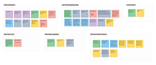
Feedback from both the interviews and usability testing was grouped into key themes using an affinity diagram.
This method helped spot common problems with navigation, messy layouts, and ways to make the site cleaner and easier for users to explore.
Key themes identified:
Navigation Positives
Navigation Issues
Clearer Text
Better Photo Experience
Original Website Overview

Before the redesign, the Chicago Pet Rescue website made it difficult for users to browse and connect with available pets. Long blocks of text, inconsistent photo sizes, and a busy layout created a confusing experience. These screenshots highlight some of the main issues that informed the direction of the redesign.
Competitor Analysis
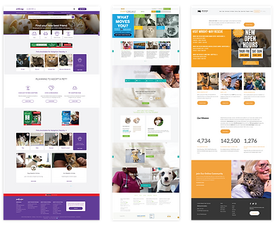
To help guide the redesign, we analyzed three pet adoption websites: Petfinder, Wright-Way Rescue, and PAWS Chicago. The goal was to understand how other organizations present adoption information, highlight pets, and encourage action. This helped us compare CPR’s current site against common design patterns and see what competitors were doing well.
Strengths Identified
-
Strong Calls to Action: Clear CTA buttons in the hero sections that direct users toward adopting, donating, or learning more.
-
Friendly Visual Style: Warm, happy, and simple styling that creates an inviting first impression.
-
Engagement Tools: Some sites offered quizzes to match users with potential pets, helping make the search feel more personal.
Website Annotations
A full audit of the original CPR website was conducted to identify specific design issues. We focused on areas that directly impacted navigation, clarity, and user experience. These annotations guided the priorities for the redesign.

Before vs. Proposed Improvements
Area Before Proposed Improvement
Brand Identity
Hero Section
Pet Listings
Adoption Application
Cartoon red logo was friendly but felt outdated
Text-heavy, unclear mission, no visual hierarchy
Inconsistent image sizes, hard to scan, disorganized layout
Positioned low on the page and asked for too much upfront, creating friction
Updated to a clean yellow logo with improved readability
Streamlined design with clear CTAs: Adopt, Foster, Volunteer, Donate
Grid layout, consistent visuals, and better hierarchy
Simplified form with progressive disclosure and a progress tracker
Card Sorting & Sitemap Refinement
To improve the site's navigation, a closed card sorting exercise was conducted with 6 participants. Each person was asked to sort 20 pieces of website content into 6 pre-defined categories.
The goal was to validate the proposed navigation structure and ensure it matched users’ mental models. The results helped confirm most groupings, with some needing adjustments.

Define
The Define stage focused on organizing everything learned during research. It brought clarity to the real needs of solo travelers and helped shape a direction for the app. By pulling out common patterns and challenges, it became easier to focus on ideas that truly matter to the people we're designing for.
User Persona
Allie Katz represents the key goals, needs, and frustrations of prospective adopters navigating the Chicago Pet Rescue website. Her profile helped keep the design process grounded in real user behavior and guided decisions about layout, functionality, and content clarity.

Meet the User
Allie Katz is a 26-year-old engineer living in Chicago who is looking to adopt a cat. She’s warm-hearted, thoughtful, and excited to welcome a new companion into her home. Her experience helped shape the redesign by highlighting the emotional and practical needs of potential adopters navigating the site.
Needs
She needs a user-friendly website that lets her easily view available cats, learn basic details like age and breed, and begin the adoption process without confusion. The experience should feel personal, clear, and supportive.
About
Allie is an animal lover who lives alone and is ready to adopt a cat for companionship. She values convenience and clarity when using adoption websites and prefers organizations that feel approachable, local, and trustworthy.
Frustrations
She feels overwhelmed by websites that are disorganized, hard to browse, or full of dense text. Mobile experiences often break down, making it difficult for her to complete tasks on the go.
Goals
Allie wants to adopt a cat from a local rescue and feel confident throughout the process. She hopes to connect with an animal she bonds with and complete the adoption steps smoothly, without unnecessary barriers.
Problem Statement
Chicagoans interested in adopting an animal from the Chicago Pet Rescue (CPR) website need improved navigation structure, search features, and more engaging visuals in order to achieve a more intuitive way to learn about available animals and complete the adoption process.
I Like, I Wish, What If
To capture user impressions in a simple and honest way, we used the “I Like, I Wish, What If” method. This helped us gather feedback on what was working, what felt frustrating, and what ideas users had for making the adoption experience easier and more enjoyable.
✅ I Like
-
Lots of photos and videos of the pet
-
All the information provided about the pet
-
Having multiple ways to help animals in need
-
Supporting a local rescue
-
That other websites had a quiz that would help match me with an adoptable animal - how delightful!
-
Seeing the impact of the rescue and how many animals they have saved
-
Understanding the mission of the rescue
-
Seeing how close the animals are to me
🟡 I Wish
-
I was able to search or sort which animals I was interested in
-
There were more animals available
-
It was clearer how to fill out an adoption application
-
Cats and dogs were featured more prominently compared to other animals
-
I could favorite an animal on the CPR website instead of having to go to PetPlace
-
The homepage was less cluttered and more focused
-
The color scheme was less alarming and more trustworthy, comforting, or delightful
💡 What If
-
IThere was an easier way to import the pet information from PetPlace
-
All the pet’s information was intergrated into the CPR website rather than externally linked
-
Mac products were supported by the CPR website
Storyboard
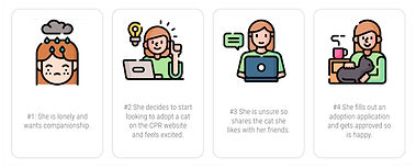
To bring Allie’s journey to life and surface her key motivations and pain points, we crafted a brief storyboard of her experience on the Chicago Pet Rescue site. This visual snapshot highlights where she feels excitement, confusion, and desire to share—guiding us toward targeted redesign improvements.
Ideate
With a clear understanding of our users' challenges and needs, we transitioned into the ideation phase. This stage focused on generating practical solutions to enhance the user experience, particularly in navigation, search functionality, and visual engagement.
Sitemap & Navigation
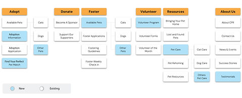
Based on insights from our card sorting exercise and user feedback, we restructured the website's navigation to align with users' mental models.The new structure is simpler, more intuitive, and reflects how users naturally search for pet adoption info, making it easier to explore and take action.
User Flow
We mapped out the steps a user takes to adopt a pet, from landing on the homepage to submitting an adoption application. This flow highlights opportunities to streamline the process and reduce friction.

Wireframes
To visualize our ideas, we created low-fidelity wireframes focusing on layout and functionality:
Homepage: Simplified design with prominent action buttons and a featured pet section.
Pet Listings: Grid layout with consistent image sizes and filter options.
Pet Profile: Emphasis on visual content and key information, with a clear "Adopt Me" button.
Adoption Application: Step-by-step form with a progress indicator to reduce user overwhelm.

Visual Style
The visual direction for Bon Voyage focused on creating a clean and approachable interface that feels friendly and easy to use. Yellow was chosen as the primary color because it feels warm, cheerful, and inviting, much like the excitement of planning a new adventure.
A custom logo was created to represent the Bon Voyage brand. Designed in bold black for clarity and confidence, it features an integrated arrow in the “Y” to symbolize direction, movement, and the spirit of discovery.
Typography and layout were kept simple and structured to support clarity and guide users through the experience without distraction. Every element, from buttons to profile cards, was designed to feel intuitive, welcoming, and aligned with the app’s goal of helping solo travelers connect with ease and confidence.

Prototype
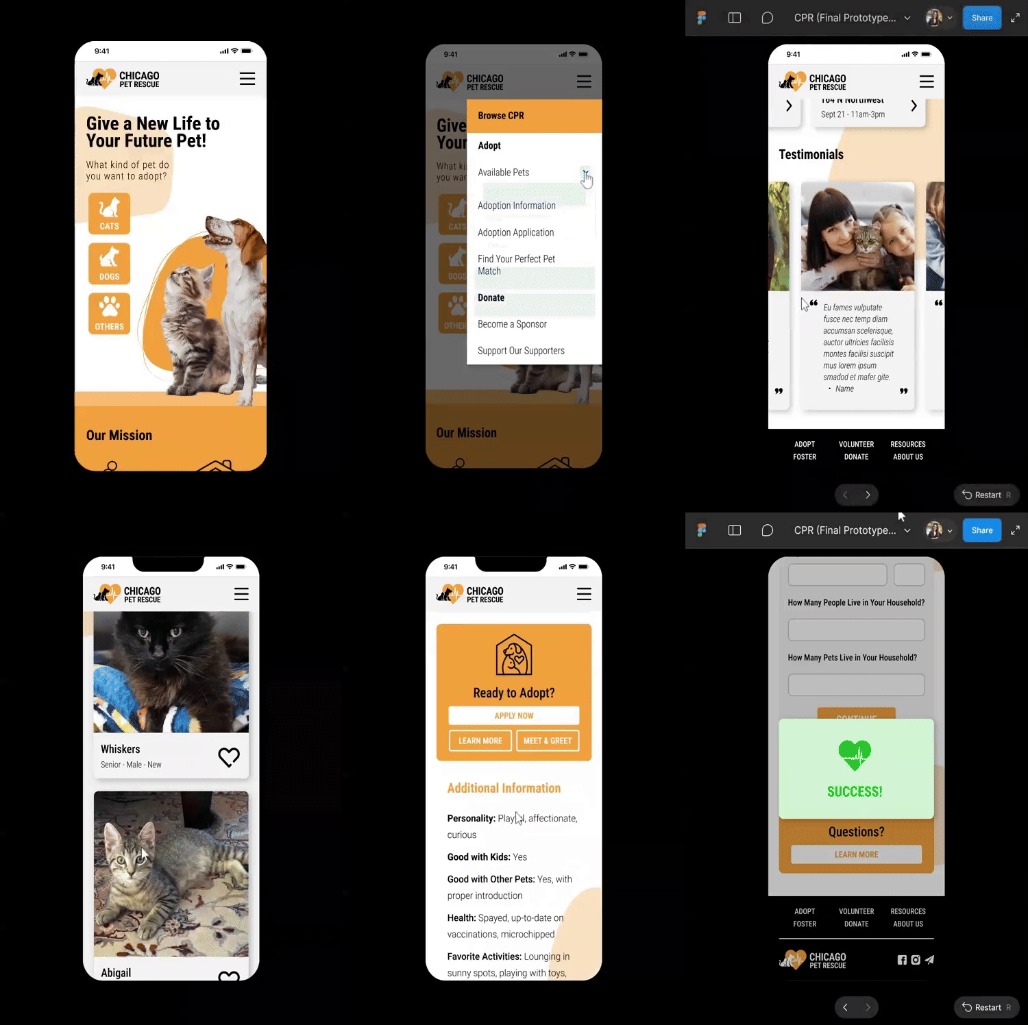
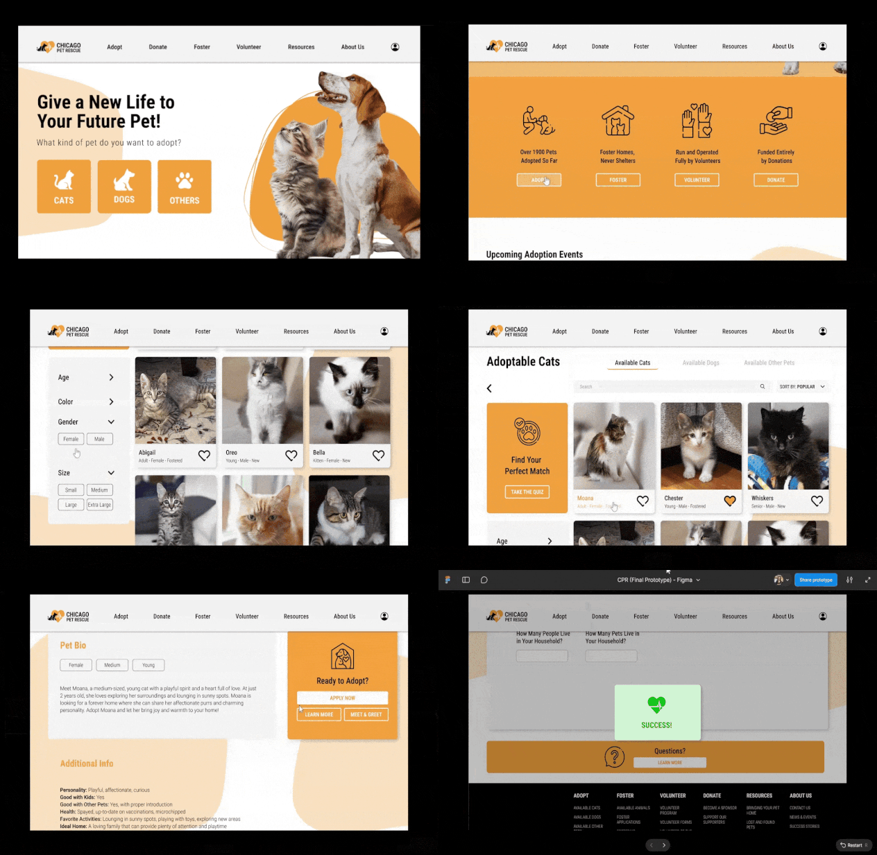
The high-fidelity prototype brought the new vision of the CPR site to life. It featured the updated brand identity, streamlined navigation, consistent pet profiles, and a homepage centered around the organization’s four primary action items: adopt, foster, donate, and volunteer. This prototype was tested on both desktop and mobile devices to ensure a responsive, smooth experience.

Usability Testing
To validate the improvements, we conducted usability testing using the same tasks from the original site. This allowed us to directly compare the effectiveness of the new design. Users were asked to complete the following scenario:
Test Scenario:
“You’re interested in adopting a cat and have just landed on the Chicago Pet Rescue homepage. Please find the list of adoptable cats, browse through them, and start the application process for one of them.”
Task Completion Summary
Task Description Users Completed
1
2
3
Navigate to available dogs
for adoption
Find basic information
about a dog
Start an adoption application
Task completed
successfully
Task partially completed
Task not completed
Key Findings
-
100% of users successfully completed all tasks
-
Improved structure and simplified navigation made the experience faster and more enjoyable
-
Users appreciated the cleaner layout and consistent visuals
-
Filters and clear calls-to-action made it easier to browse and take action
-
Both mobile and desktop versions supported seamless interaction
Before & After
The original CPR website had a heartfelt mission but lacked visual hierarchy and clarity, which made the adoption process feel overwhelming. In contrast, the redesigned version offers a cleaner layout, clearer calls to action, and an improved structure that makes it easier to browse animals, understand CPR’s mission, and take action.
Side-by-side screenshots below show the transformation from a cluttered interface to one that’s clean, focused, and easier to navigate.


Project Reflection
Redesigning the Chicago Pet Rescue website was a rewarding experience that showed the impact of putting user needs first. By grounding decisions in research and testing, we were able to simplify a once confusing process and turn it into something more intuitive and approachable. From restructuring the navigation to refining how animals are showcased, each step helped make the site easier to use and more aligned with CPR’s mission. While there’s always room for improvement, this redesign laid a strong foundation and gave the organization a clearer digital presence. Projects like this remind me how thoughtful design can support real-world action and help connect people with causes they care about.

