
Case Study

About the Project
UX/UI Toolkit
Project Overview
My Role
Timeline


Zentro, a high-speed internet service provider, needed a way to better reach building developers and property owners. Previously, there was no dedicated page highlighting Zentro’s services for this group, limiting online visibility and making it harder for potential clients to consider Zentro alongside competitors. The goal was to create a clear, informative landing page that positioned Zentro as a strong, modern option for new and existing developments.
UX Research, Strategy, Wireframing, UX/UI Design, Testing, Visual Design, Final Launch (Fully responsible for the project from initial research through final handoff and live deployment.)
3 weeks (covering research, design, prototyping, and user testing).
Empathize
The Empathize phase focused on understanding what building developers and property owners really needed when researching internet providers. Through interviews, competitor research, and organizing feedback, the goal was to uncover key expectations, frustrations, and decision factors that would help shape a page that felt clear, useful, and competitive.
User Interviews

To better understand the needs of building developers and property owners, I conducted informal conversations with a few developers alongside formal interviews with Zentro’s sales team. These discussions provided valuable insights into common expectations, questions, and decision drivers when choosing an internet service provider. This research phase was completed during the first week of the three-week project timeline and helped guide the structure, content priorities, and messaging for the new landing page.
100% of the time price and customer service are important.
Network uptime and they will look for reputation, they like to know our clients.
Maybe just for general people who want inquiries they can set up a time to chat, you know?
Local customer support instead of robots
Developers appreciate internet for all the amenities in the building.

Affinity Diagram
Notes and feedback from the interviews were organized into key themes using an affinity diagram. This helped spot common patterns in what developers need, expect, and value most when choosing an internet service provider. Grouping insights this way made it easier to focus the design on the most important content for the landing page.

Price
What They Want
Add-ons
Why Zentro
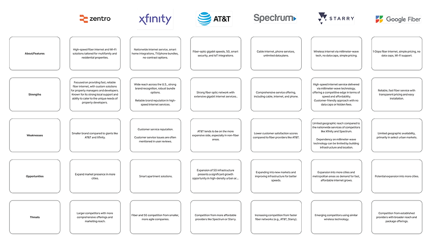
Competitive Analysis
A competitive analysis was done to see how current platforms support social connection during travel.
Apps like Meetup, Couchsurfing, and Bumble for Friends help people connect, but they don’t fully support the specific needs of solo travelers. Bon Voyage is exploring ways to fill that gap by helping travelers meet others based on where they’re going, when, and the kind of experience they want to have.

Define
The Define stage focused on organizing everything learned during research. It brought clarity to the real needs of solo travelers and helped shape a direction for the app. By pulling out common patterns and challenges, it became easier to focus on ideas that truly matter to the people we're designing for.
User Persona
David Miller represents the key needs, goals, and challenges of the target audience. This persona helped guide the design process by keeping the user at the center of every decision made during the project.

Meet the User
About
David Miller is a 42-year-old building developer with over 15 years of experience managing large residential and commercial projects. His daily responsibilities include selecting contractors and service providers, ensuring infrastructure decisions meet tenant needs, and staying within budget without sacrificing quality.
David is experienced in managing large building projects and infrastructure decisions that impact long-term tenant satisfaction.
He often evaluates multiple vendors at once and expects clear, organized information to make comparisons easy and efficient.
Needs
David needs a landing page that explains service options clearly, highlights key benefits, and makes it simple to schedule a meeting or contact a representative without unnecessary friction.
Frustrations
David’s main frustration is when service providers don’t offer enough information upfront. Without clear, accessible web content, he is less likely to engage or follow up, preferring vendors who are transparent and easy to research independently.
Goals
David’s goal is to efficiently filter internet providers that serve his project’s location, gather key information to request proposals, and present strong options to either board members, leadership teams, or internal decision-makers.
He looks for providers that offer reliable, scalable service and can meet both immediate project needs and long-term tenant expectations, all while fitting into budget and timeline requirements.
Problem Statement
Building developers and property owners had no easy way to find information about Zentro’s internet services online. Without a dedicated landing page, potential clients could not easily discover Zentro, understand the service offerings, or consider Zentro alongside other providers during early research stages.
UX Hypothesis
By creating a clear, easy-to-navigate landing page focused on developers, Zentro would improve visibility and awareness among potential clients.
This would make it easier for developers to learn about Zentro during their initial research and consider it as an option when evaluating internet providers for their buildings.
Value Proposition
The developer landing page improves Zentro’s visibility among building developers and property owners.
It allows potential clients to quickly understand Zentro’s service options, key benefits, and experience, helping position Zentro as a trusted and discoverable option early in their decision-making process.
Ideate
The Ideate phase focused on transforming user needs into potential solutions. Based on the insights gathered, early concepts were developed to map out how users like Jennifer might interact with the product and move through key tasks.
User Flow
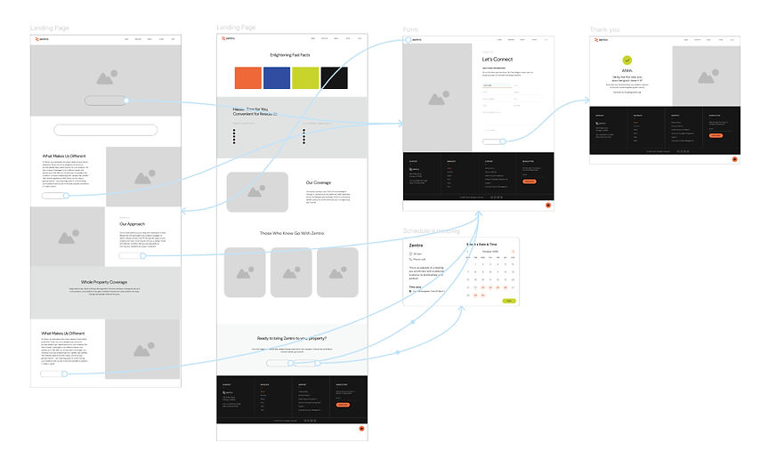
The user flow focused on making the developer landing page easy to discover and navigate. The main strategy was to drive traffic through Google search, supported by targeted Google SEM campaigns to boost visibility among developers actively researching internet providers.
In addition to organic and paid search, two secondary access points were considered: including the landing page link in sales representatives' email signatures and sharing it through personalized sales emails. These additional efforts were meant to give the sales team an extra tool to support conversations and present Zentro’s value from another angle.
The flow was designed to guide visitors naturally toward exploring service information, understanding key benefits, and taking action through a simple contact form or meeting scheduler.

Wireframes
Low-fidelity wireframes were created to explore the layout, navigation, and content structure of the new landing page.
Since Zentro already had established brand guidelines, the goal was to keep the design visually consistent with the rest of the site while making small refinements for clarity, simplicity, and easier user flow.
The wireframes focused on highlighting key service benefits, keeping the page clean and easy to scan, and providing straightforward next steps through a contact form and meeting scheduler.
Visual Style
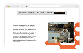
The visual style for the developer landing page stayed closely aligned with Zentro’s existing brand guidelines. The goal was to maintain consistency while making the page slightly cleaner, easier to navigate, and more action-focused.

LOGO

COLORS

TYPOGRAPHY
Aa
Heading (H1) | DM Sans Bold | 50 px
Subheading (H2) | DM Sans Regular | 40 px
Body Text | DM Sans Regular | 16 px
Button Text | DM Sans Bold | 16 px
Usability Testing
A small usability test was conducted internally with Zentro’s sales and marketing team to validate the flow, content, and clarity of the landing page.
Participants were asked to complete basic navigation tasks that reflect real developer needs when exploring service providers.


Task Completion Summary
Task Description Users Completed
1
2
3
4
Find where to schedule a meeting
Find where to contact an expert
Find where to see current clients
Find where to learn about Zentro’s service benefits
Key Findings
-
100% of users successfully completed all tasks
-
Overall positive feedback on page flow and clarity
-
Minor suggestions focused on image preference and extra helpful resources (such as network maps)
A/B Testing
An informal A/B test was also conducted to validate design decisions, especially around imagery and key call-to-action ideas.
Participants were asked to share preferences and feedback on specific page elements before finalizing the design.
Key Results:
-
Hero Image Preference: 62.5% preferred Option 1, 37.5% preferred Option 2
-
Network Map: 87.5% of participants found it useful and suggested including it
-
Schedule a Meeting CTA: 75% agreed it would add value for developers
-
Signature Link (MDU Landing Page): 100% said they would like to include the page link in their email signatures
Final Developer
Landing Page
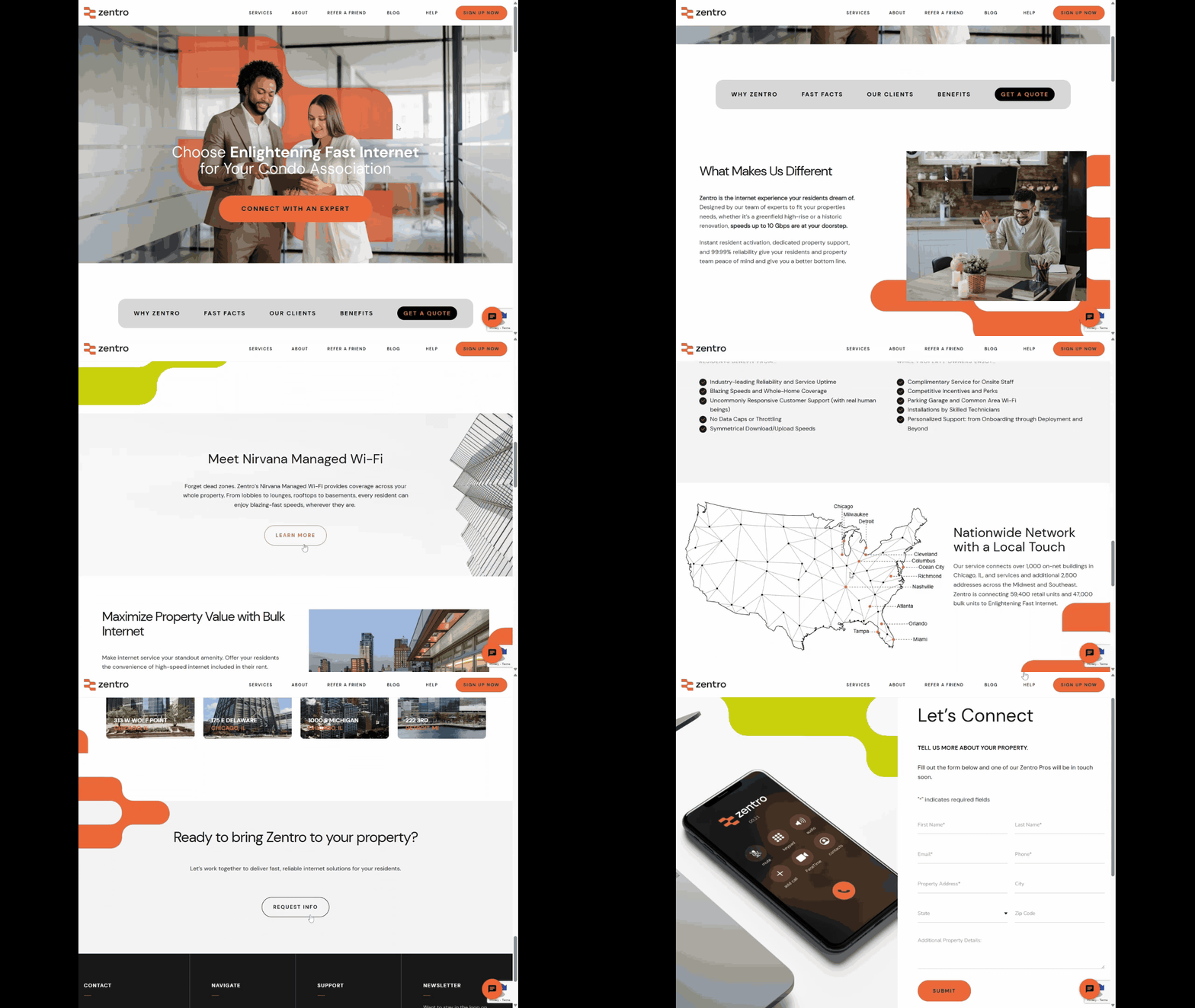
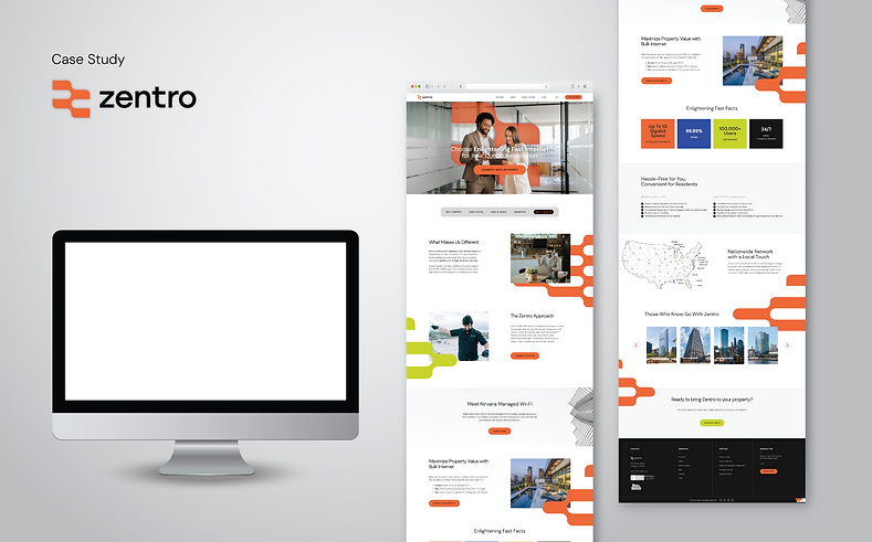
The final design brought together research insights, usability testing feedback, and brand consistency to deliver a live landing page tailored for building developers and property owners.
The page focuses on clear information, easy navigation, and simple ways for potential clients to learn about Zentro’s service offerings and take the next step.
Project
Reflection
-
Listening to different perspectives played a key role in shaping the landing page structure and improving the final result.
-
Early feedback and internal collaboration helped surface better ideas, leading to a stronger, more targeted user experience.
-
The landing page is now live, helping Zentro increase visibility with building developers and property owners during early research stages.
-
The "Schedule a Meeting" feature, while popular during testing, will be added in a 2.0 version due to the complexity of managing sales calendars across different cities.
-
This project opened the door for me to lead larger initiatives at Zentro, including a full redesign of the web checkout experience and a new homepage refresh.

